


gettie ( arc)
arc) 


getimiskon
 0
0
 0
0
 1
1


kaia
kaia@brotka.st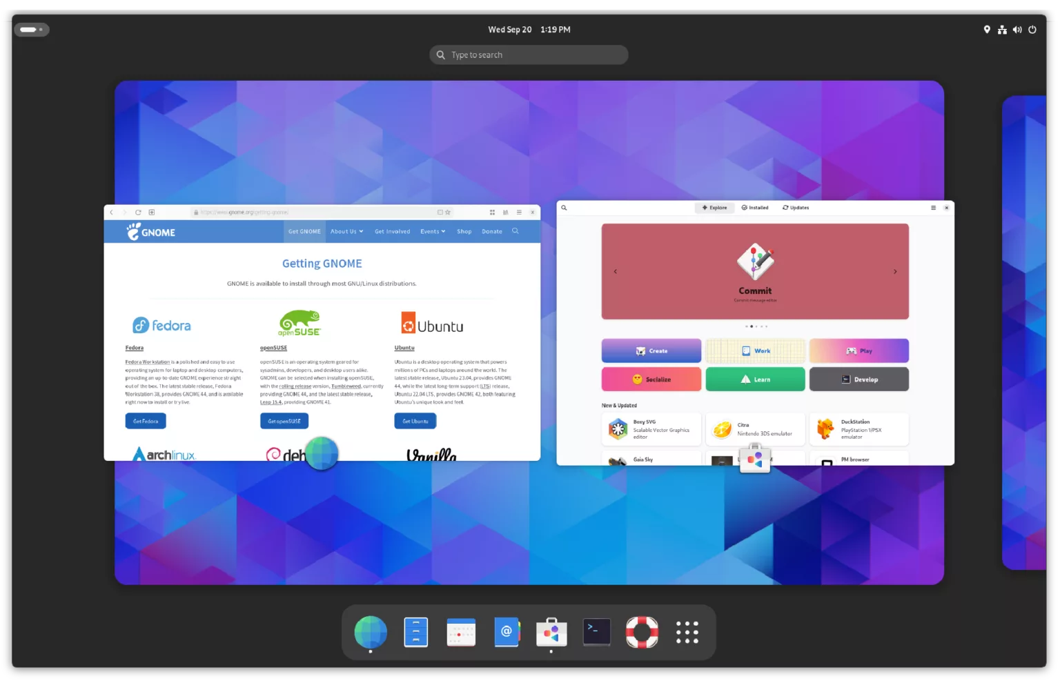
 2
0
0
2
0
0
Trash Panda
raccoon@hollow.raccoon.quest@kaia@brotka.st
"Something good is better than something bad, fight me"
Says girl knowing full well she's stating the obvious
0
0
1


Oblomov
oblomov@sociale.network@kaia GNOME peaked with GNOME 2, because Sun Microsystem invested massively in making it into a commercial-level desktop environment.
0
0
1
giru
giru@clubcyberia.coAlso dash to dock makes gnome a lot more usable to me
0
0
1
Ratatöskr (F.k.a. Johannes M.)
dr_jo_mue@troet.cafe@kaia hat diesen NT4-Look. eigentlich ganz nice. Leider noch nicht mit guten Bildschirmschriften ausgestattet (irgend ein Helvetica-Knockoff)
0
0
1
Julius Schwartzenberg - Юліус
jschwart@mas.to@kaia I fully agree and I miss this. I was using KDE 1 for a long time which looks quite similar.
0
0
1


m0xEE
m0xee@librem.one@silhouette
It is! It didn't look cool back in the day either. But the UI designs we have today are just garbage IMO, especially what Apple dies — just looking at that is painful 😖
But the worst part with modern GNOME is that in an attempt to make it more "streamlined" they've managed to make it both garbage and way less customisable — you can't even make it look better without putting significant effort into it.
@kaia
1
0
0
Jens Finkhäuser 🌻
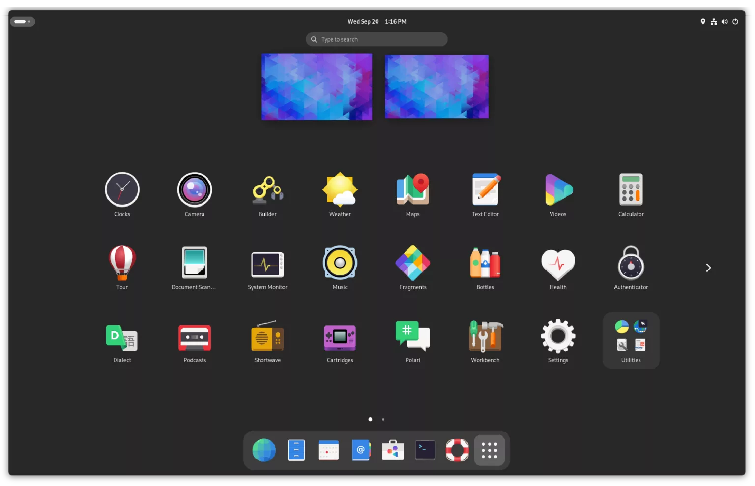
jens@social.finkhaeuser.de@kaia I liked that GNOME, but it was sufficiently resource hungry that at the time I preferred other stuff.
0
0
1
m0xEE
m0xee@librem.one@silhouette
I can see where this is coming from: you don't even think about customisation as long as you like everything and think that it's only people who have too much time on their hands do.
It was the same with me and early Mac OS X — there are some changes that you can adapt to and I did up to 10.9, but 10.10 was so bad that it made my blood boil, on my two 30" displays using it was genuinely a tiring experience.
I treasure having the option to fix things I don't like about the UI😄
@kaia
1
0
0
accela
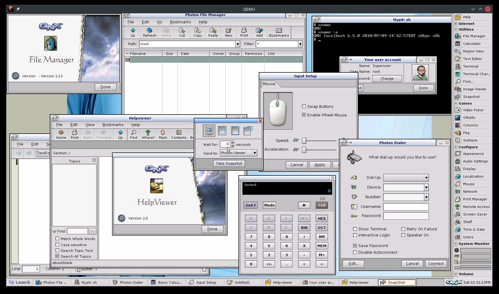
accela@libretooth.gr@kaia The golden age of icons. Horrible for scaling and accessibility but still so deliciously looking little pieces of art.
Personally, i consider QNX as the champion of the UI art of the time, but GNOME (1 and 2) had some really good ones too.
I never found if that particular shaded style of icons, banners, throbbers etc had a name, if there was an origin artists influenced by or it was just happened.
 1
0
1
1
0
1
@kaia@brotka.st Hmm, not sure to be honest. I do prefer the modern look - back in the day I also skinned GNOME 2 to look "better". But I do think, the UI design (besides aesthetics) of GNOME 3 is really good - way better than Windows, GNOME 2, KDE, ...
0
0
1